In this article let's go through the Shipping Volumes dashboard together and have a better understanding of what insights you can get out of it.
To open the dashboard, follow the steps below.
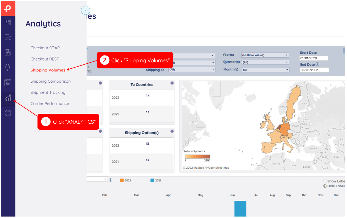
This dashboard allows you to break down outbound and inbound volumes of carriers, shipping options, countries, and sub-accounts over time (Shipment Creation Date).
Note
This dashboard is only about shipments that have already been scanned.
Main Menu
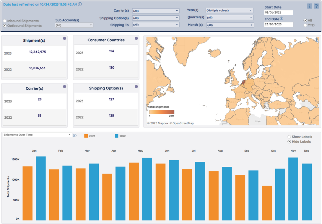
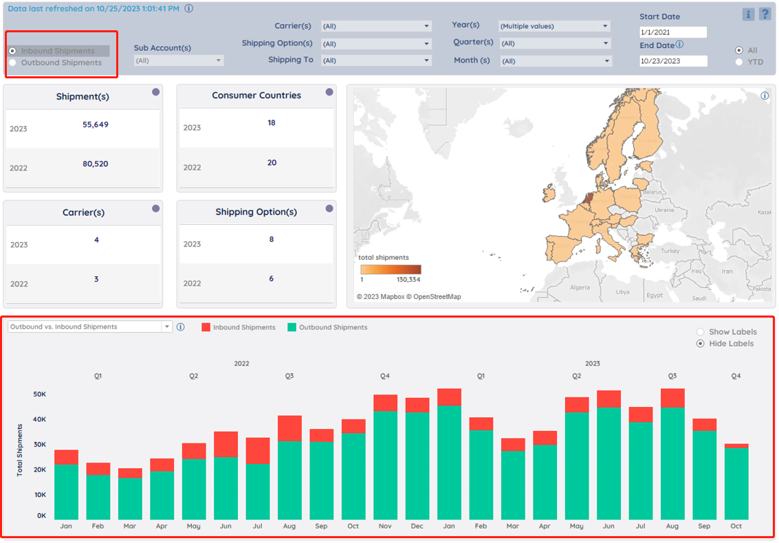
Select the variables you want to include (or exclude) in the charts, tables, and map.
Inbound Shipments/Outbound Shipments
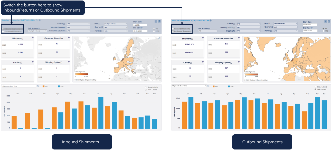
You can check the inbound (return) shipments or outbound shipments by simply switching the button below. The Outbound vs. Inbound Shipments chart is not influenced by this button.
Update Notification

Note
The dashboard is updated daily.
All/YTD
Year-to-date (YTD) represents a period of time between the beginning of the selected year(s) and the current date (month/day).

Manual & FAQ page
Go to the manual (information icon) and FAQ page (question icon) by clicking on the icons on the right top of the dashboard.

Tables – Shipment(s) / To Countries / Carrier(s) / Shipping Option(s)
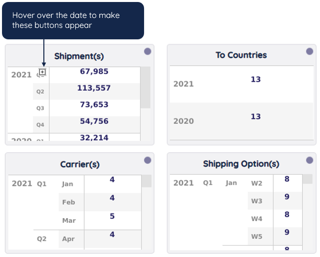
Each table presents the total per year(s)/quarter(s)/month(s)/week(s)/day(s) for the variables selected in the main menu.
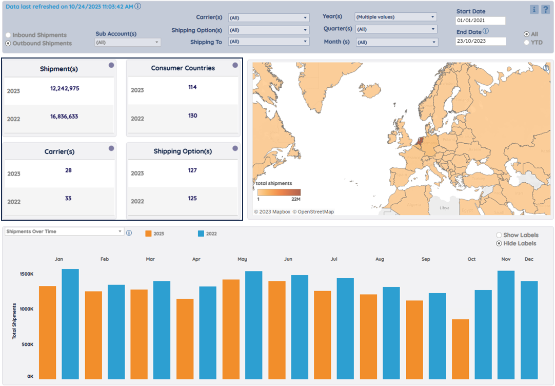
Click on the plus/minus buttons to drill down/drill up time levels.
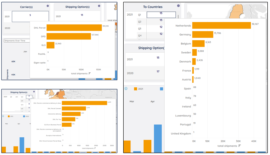
Hover over the numbers to see more details per category.
Map
This map displays the division of the total number of shipments over the different countries, based on the variables selected in the main menu.
Hover over a country on the map and you can view the sorted shipping volumes of different shipping options/carriers in that country.
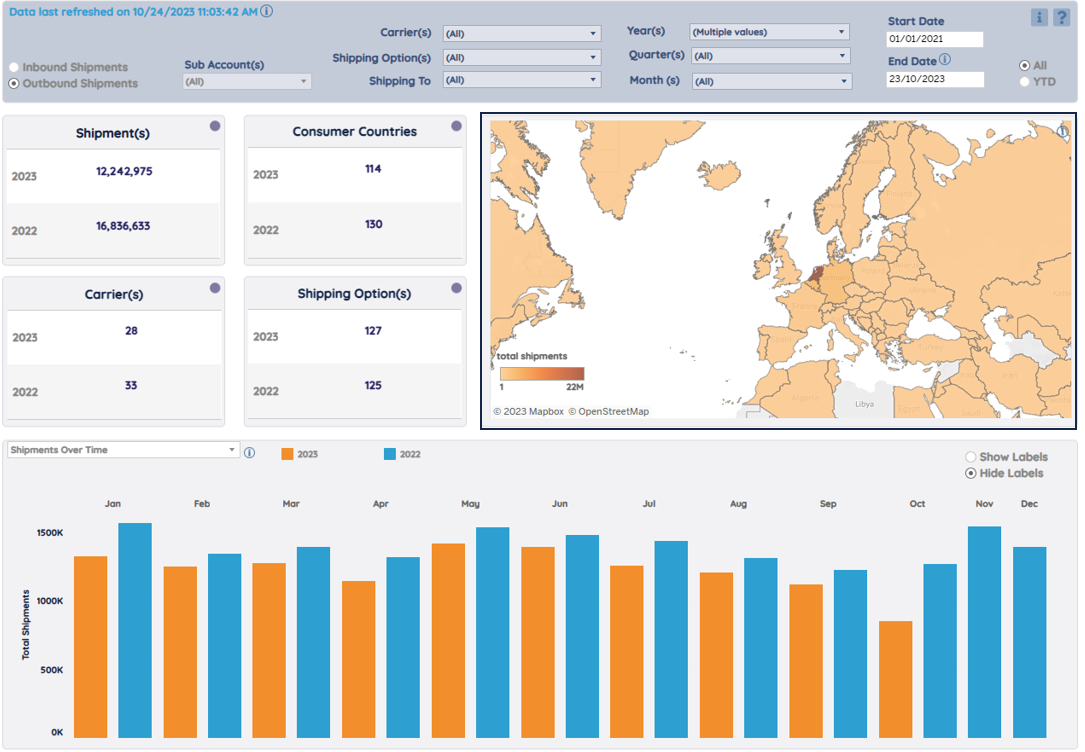
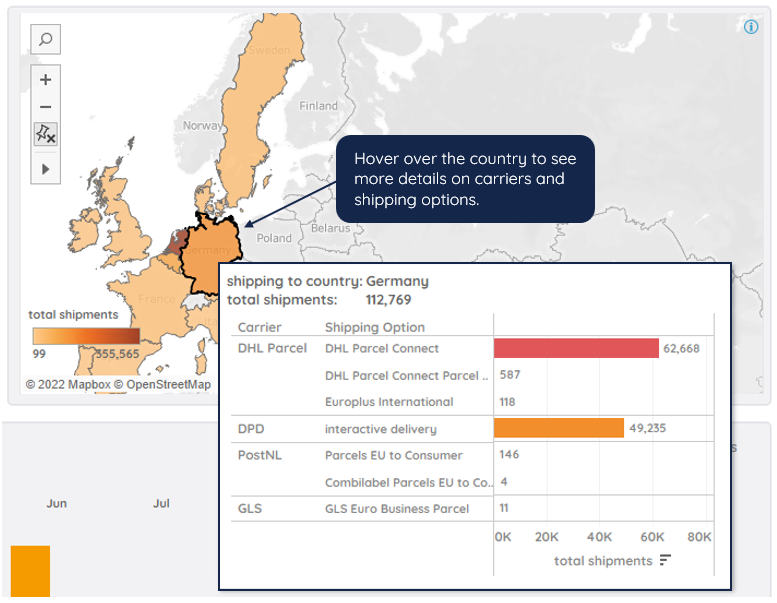
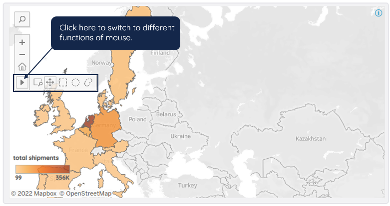
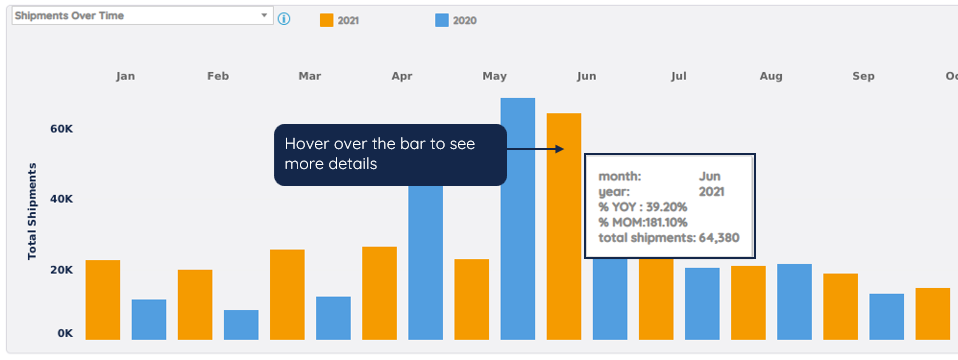
Chart - Shipments Over Time
This chart offers a breakdown of shipping volume over months, weeks, or days.
You can compare growth, track trends, and quickly target abnormal drops or rises.
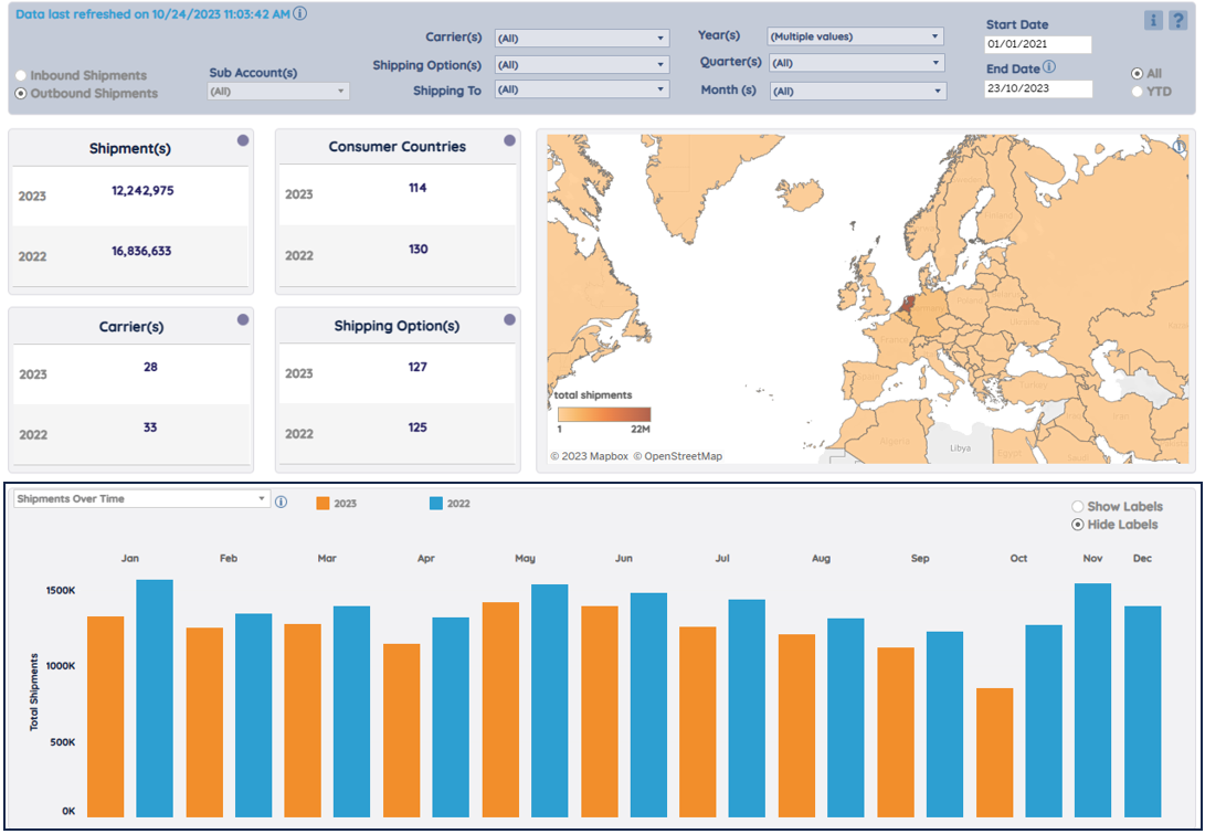
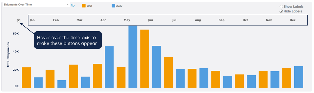
Click on the plus/minus buttons to drill down/drill up time levels.
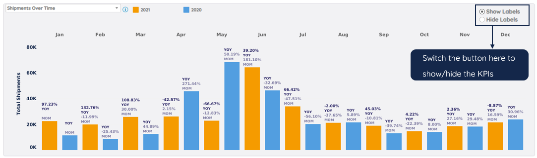
Hover over the bar to see:
- A comparison to the same month last year (%YOY)
- A comparison to last month (%MOM)
- The total number of shipments (total shipments)
Note
A comparison can only be made if all relevant variables are selected in the main menu.
Chart – Running Total (YTD)
This chart offers an annual breakdown of cumulative volume over months.
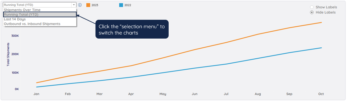
Hover over the line to see the cumulative (total) volume.
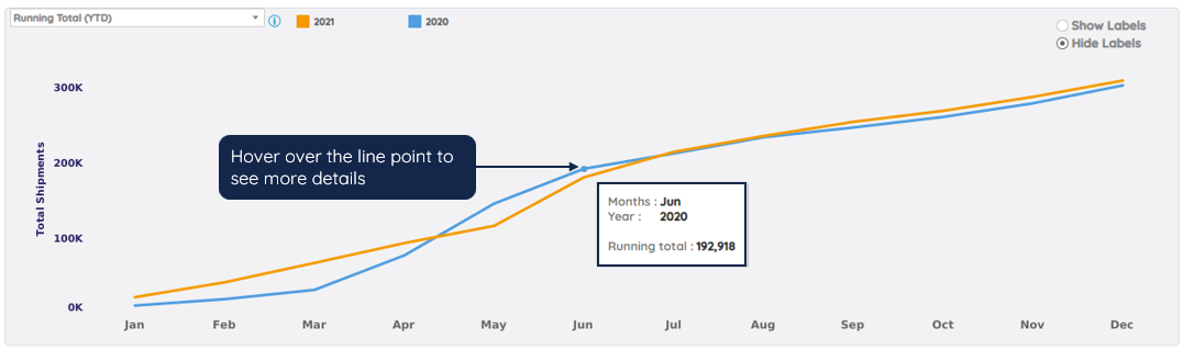
Chart – Total shipments over the last 14 days
This chart offers a breakdown of scanned shipments that were created over the last 14 days.
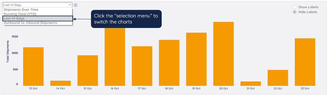
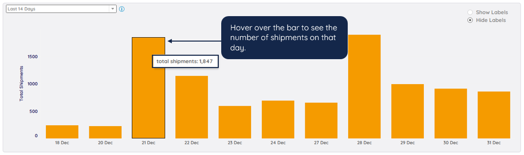
Chart – Outbound vs. Inbound Shipments
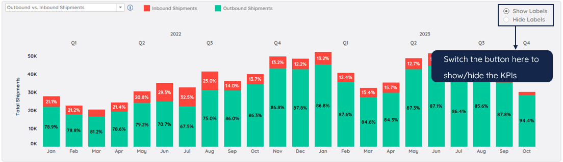
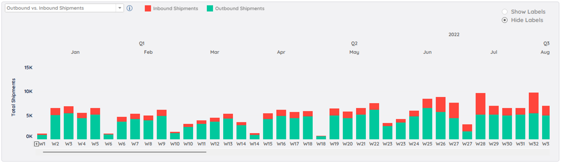
This bar chart offers an overview of outbound and inbound volumes comparison over time.
Here you can quickly check the % of inbound shipments per month and observe the trend of it.
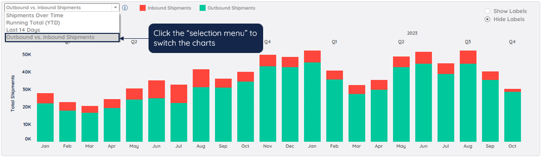
This chart is not influenced by the Inbound Shipments/Outbound Shipments button.
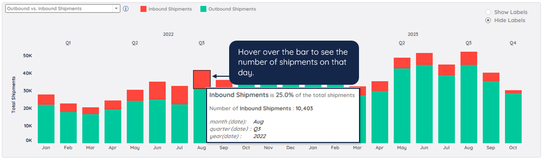
Click on the plus/minus buttons to drill down/drill up time levels.
Was this article helpful?
That’s Great!
Thank you for your feedback
Sorry! We couldn't be helpful
Thank you for your feedback
Feedback sent
We appreciate your effort and will try to fix the article